Optimizing Service Discovery Page
PRODUCT DESIGN
USER INTERFACE
Contribution
Worked on concept ideation, interface design, responsive design, user flow creation and UAT under the guidance of my Manager. The project time was 2 -3 weeks.
Project brief
Currently, out of 1,500 users landing on the experts service page, only 500 navigate to Editage(provide human editing services). The page presents a generic view with no specific details about the available services, leading to low engagement. As a result, only 0.5% of users proceed to view and submit the form for Editage services
Takeaway
This project highlighted the importance of knowing when to stop, balancing essential information with minimal effort while preserving context. It also reinforced the value of collaborating with new teams, offering fresh perspectives and insights into different products.
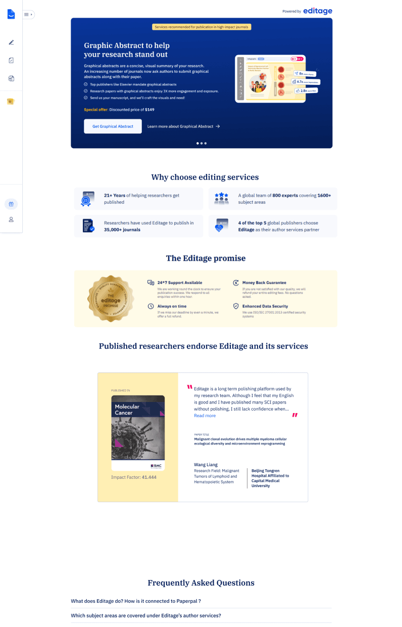
Impact
The launch of the revamped service page had a significant impact, driving an 81% increase in conversions over three months and we have provided around 140 jobs while generating over $50k in revenue.
Takeaway and Impact
Content structure
📍Service Overview
Brief description of the service and its purpose. Highlight who it’s for and the problem it solves.
📍Why Choose This Service?
Key benefits and unique selling points.
📍Access & Support
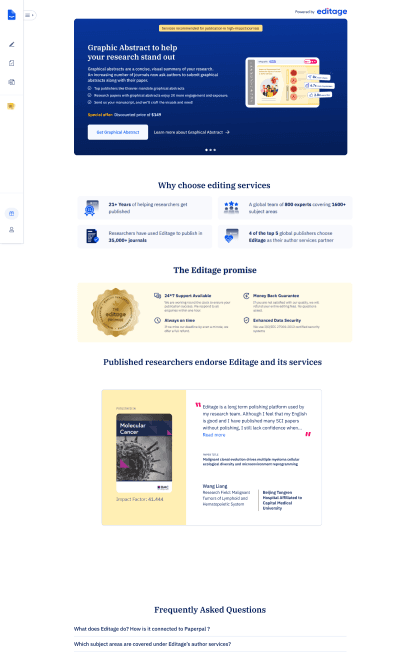
This section outlines the service access process, pricing, payment options, and FAQs for quick issue resolution.
Design strategy
Prioritizing Visual Hierarchy
Use engaging visuals to enhance understanding and create quick recognition of the service.

Building Trust with Social Proof
Build trust with testimonials, ratings while ensuring transparent pricing.

Highlighting Value Proposition
Clearly highlight the service’s value with concise descriptions and key benefits.

Driving Conversions
Provide clear calls-to-action for service access, along with samples to help users make informed decisions.

After analyzing service pages and identifying key sections, my focus was on creating a clear, intuitive layout that balances content and visuals while guiding users toward action.
Iterations
Evolution of card designs
The initial approach was to design auto-scrollable individual cards as the main header, similar to the original Editage page.
This layout provided more space to include detailed information, larger visuals, and multiple CTAs, ensuring a more engaging and informative experience.
After receiving feedback, we chose to refine the layout to align with the Paperpal design system. Although we’re promoting Editage services, it was crucial to maintain consistency with our product’s visual language. We also decided to feature all three services together in the header as cards, making it easier for users to compare offerings at a glance.
General designs for service cards
*Horizontal cards( we decided not to go with this)

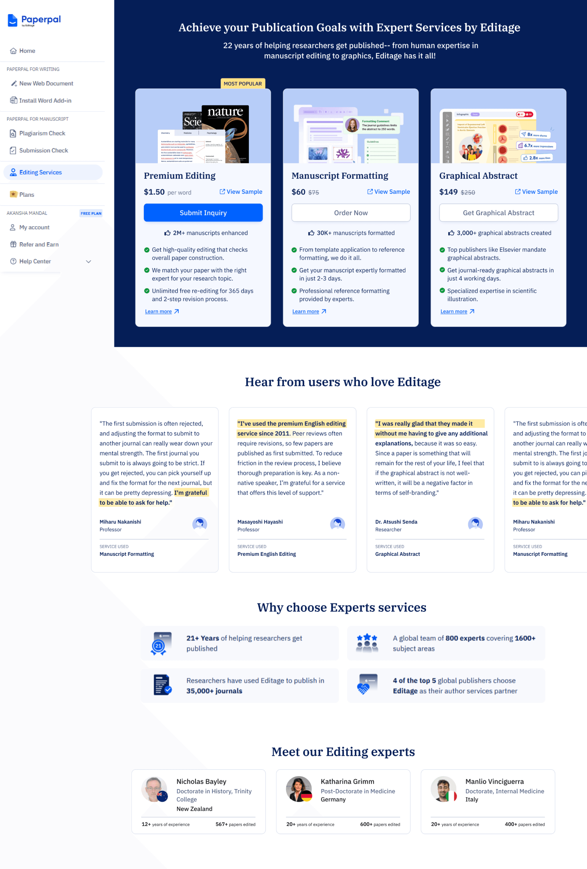
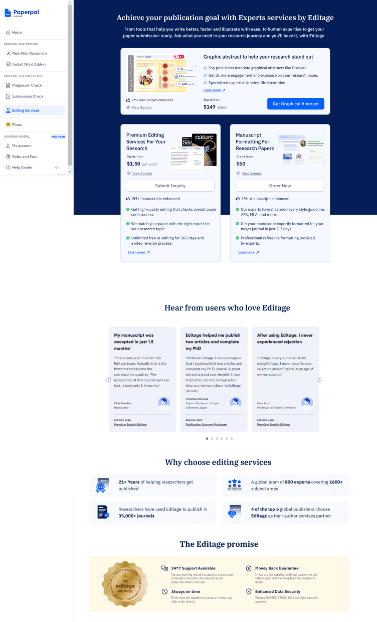
Final Implementation
FINAL CARD designs
service page design
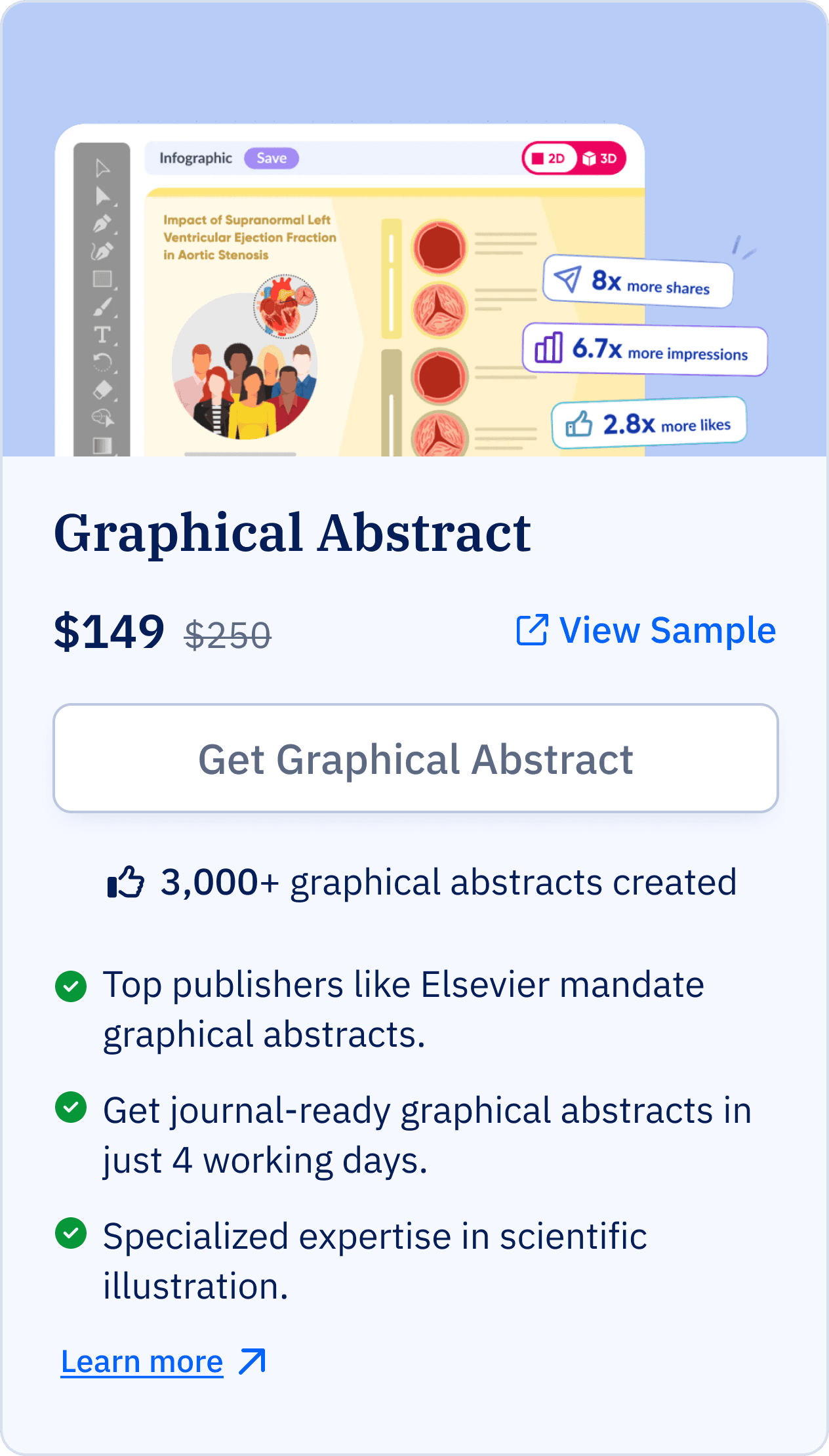
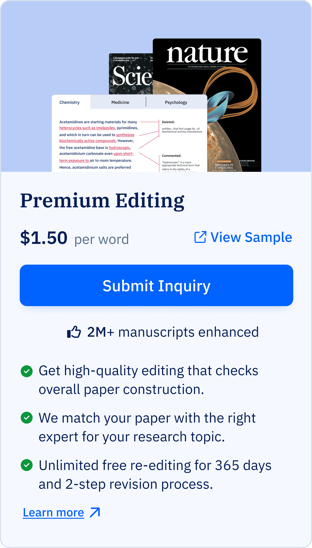
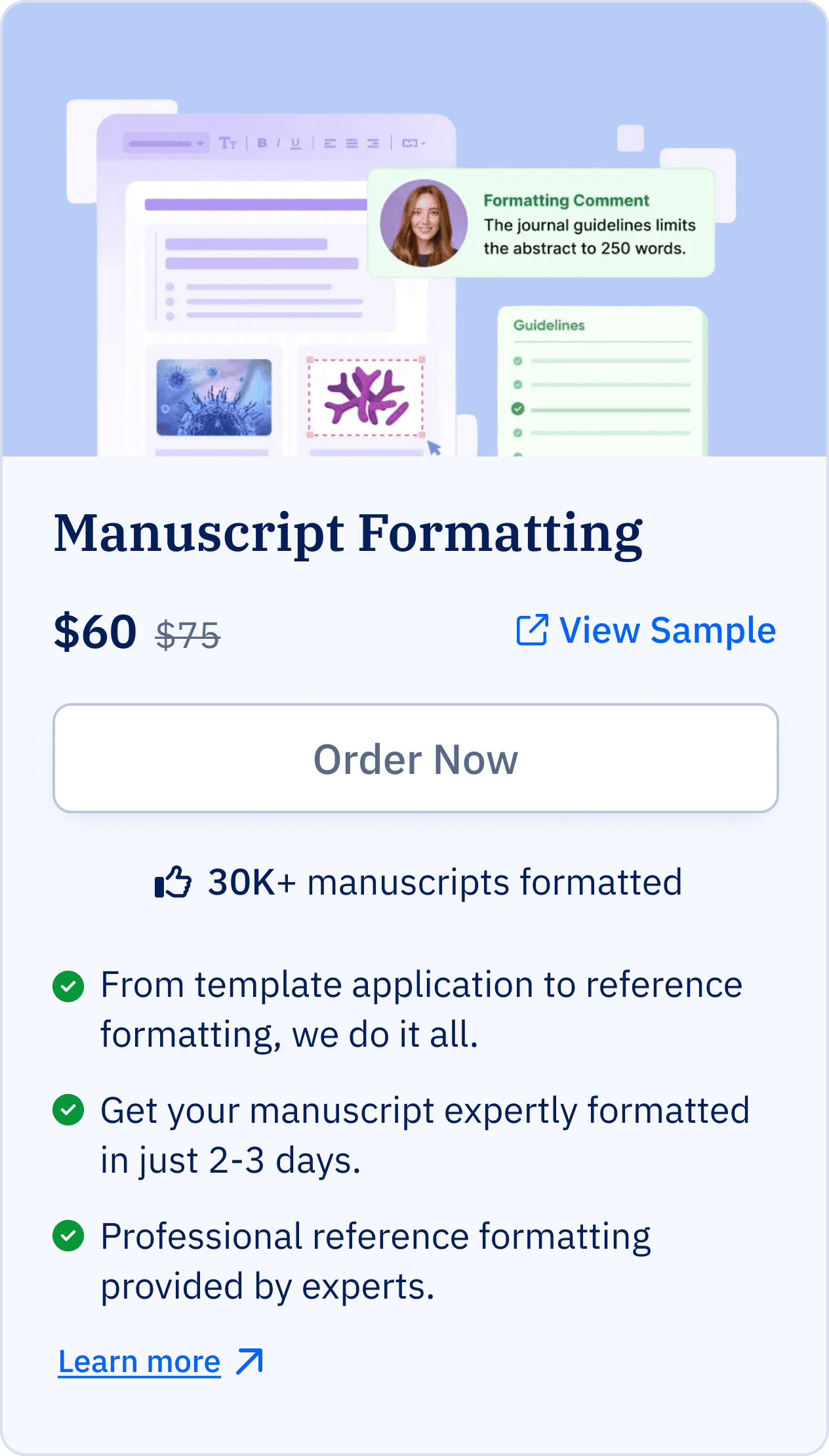
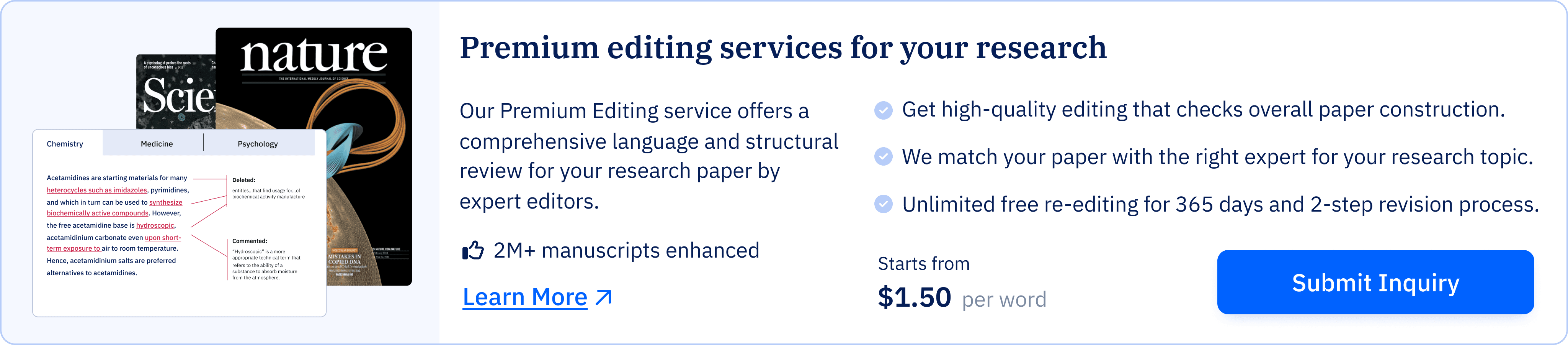
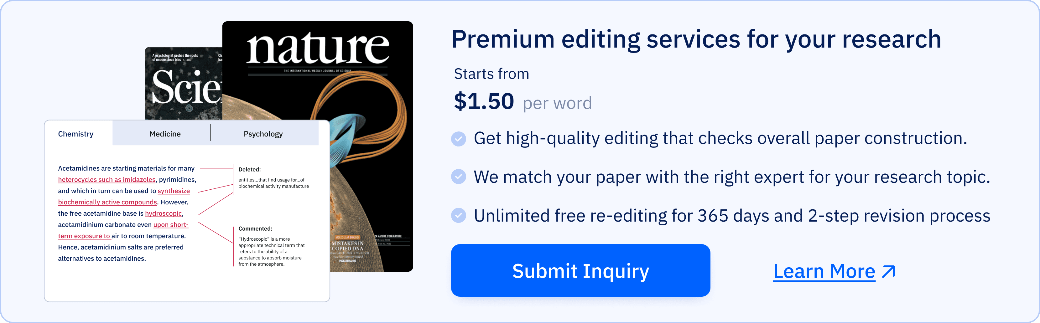
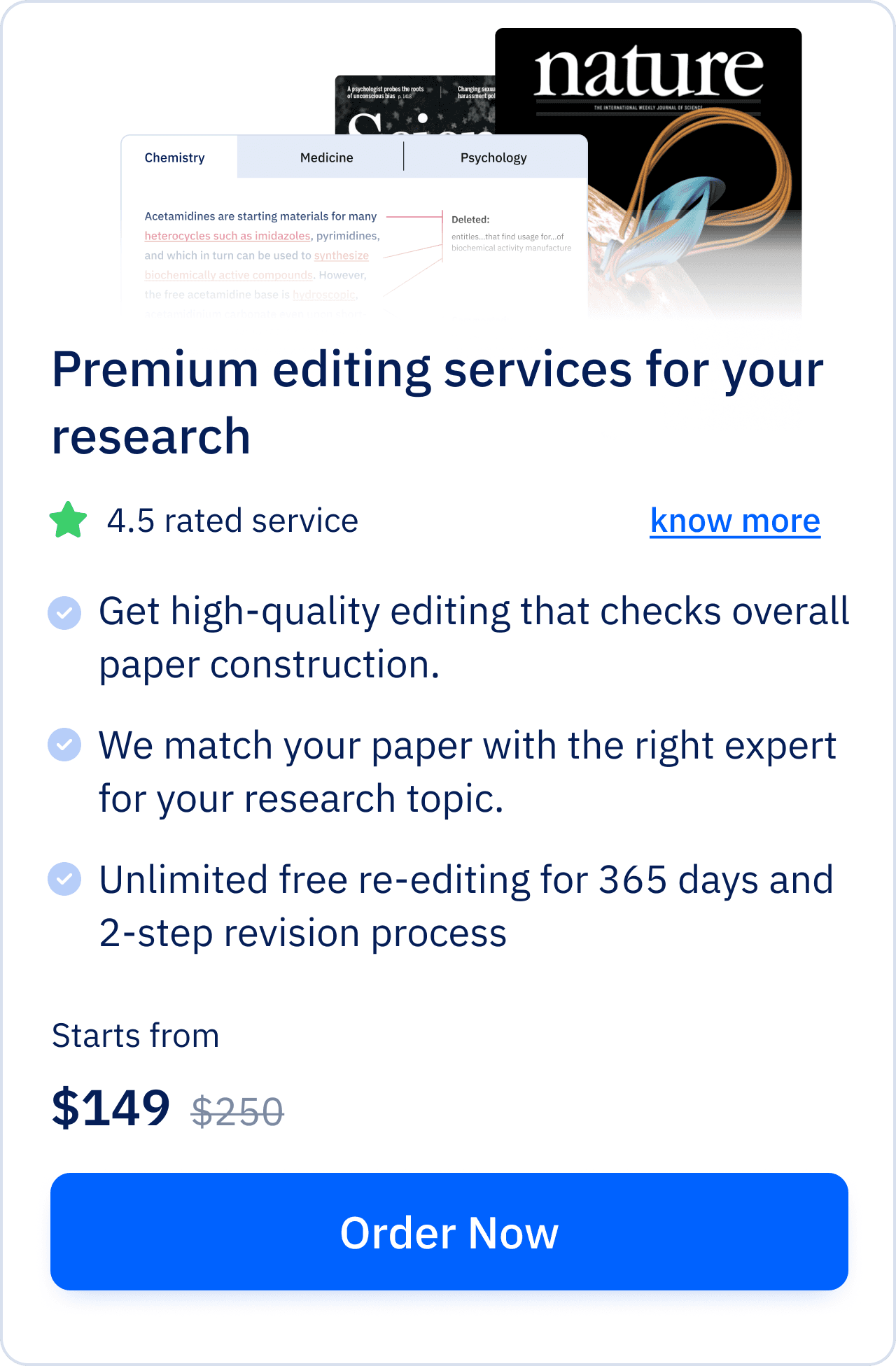
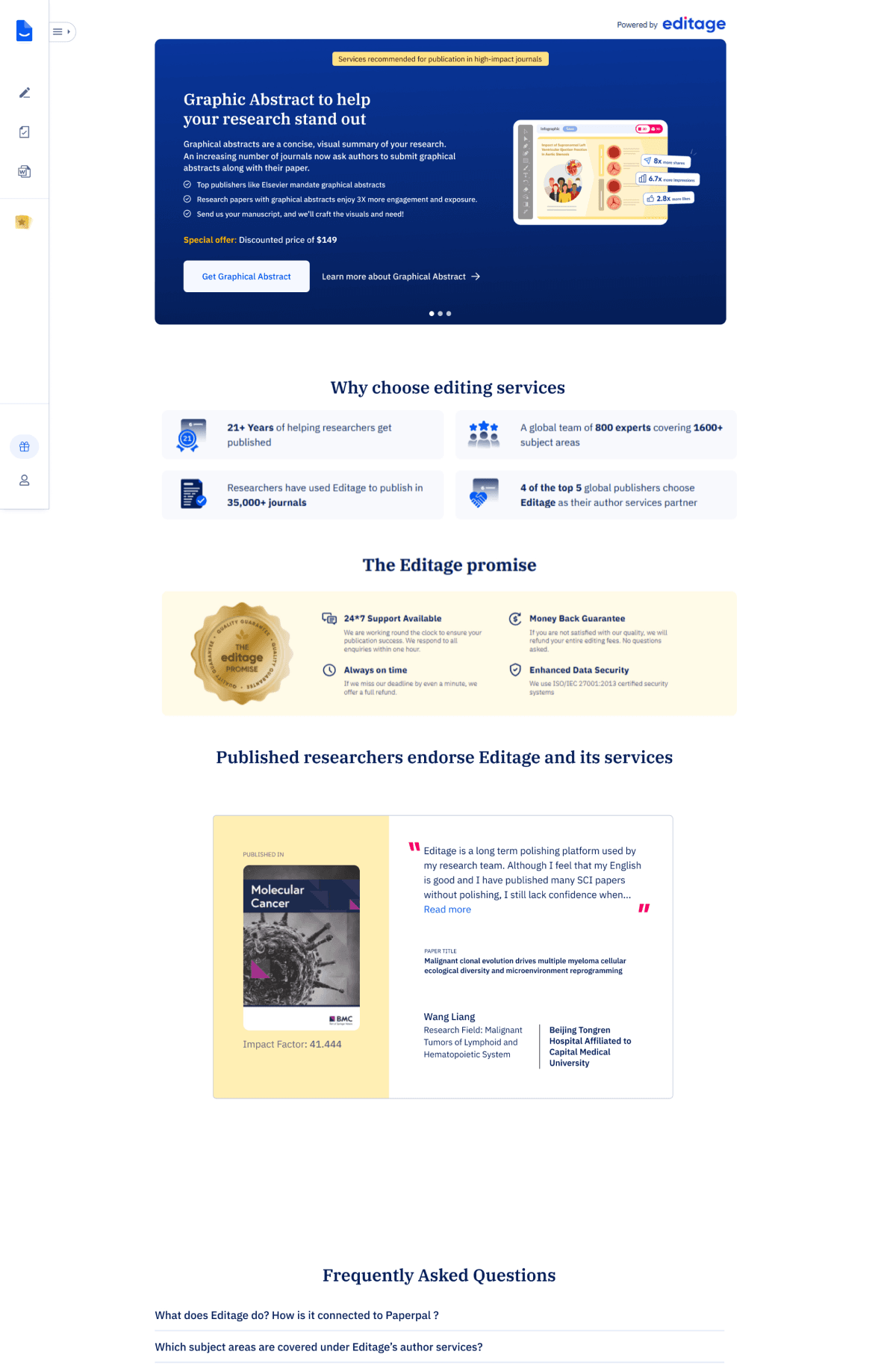
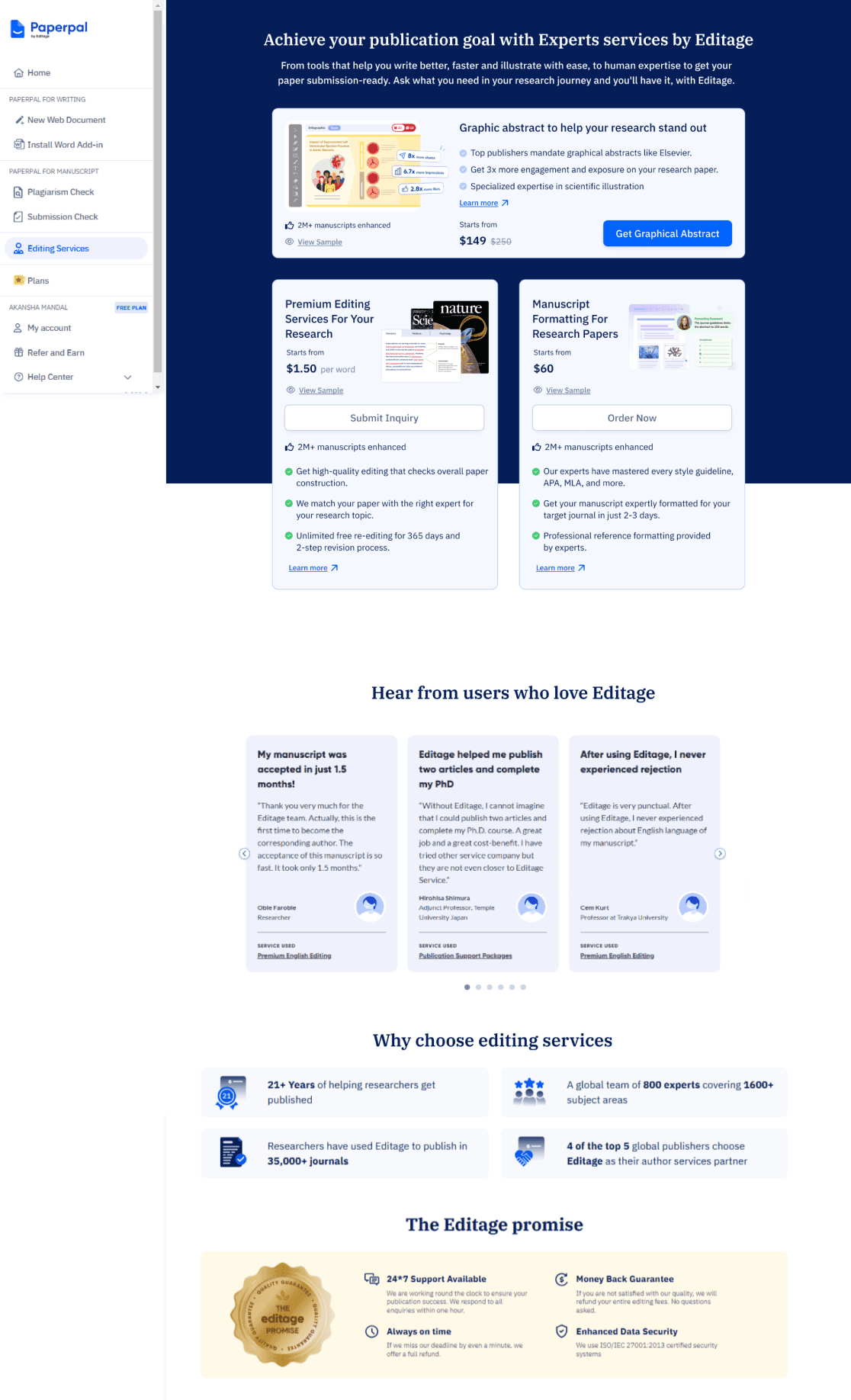
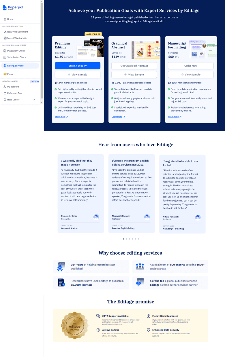
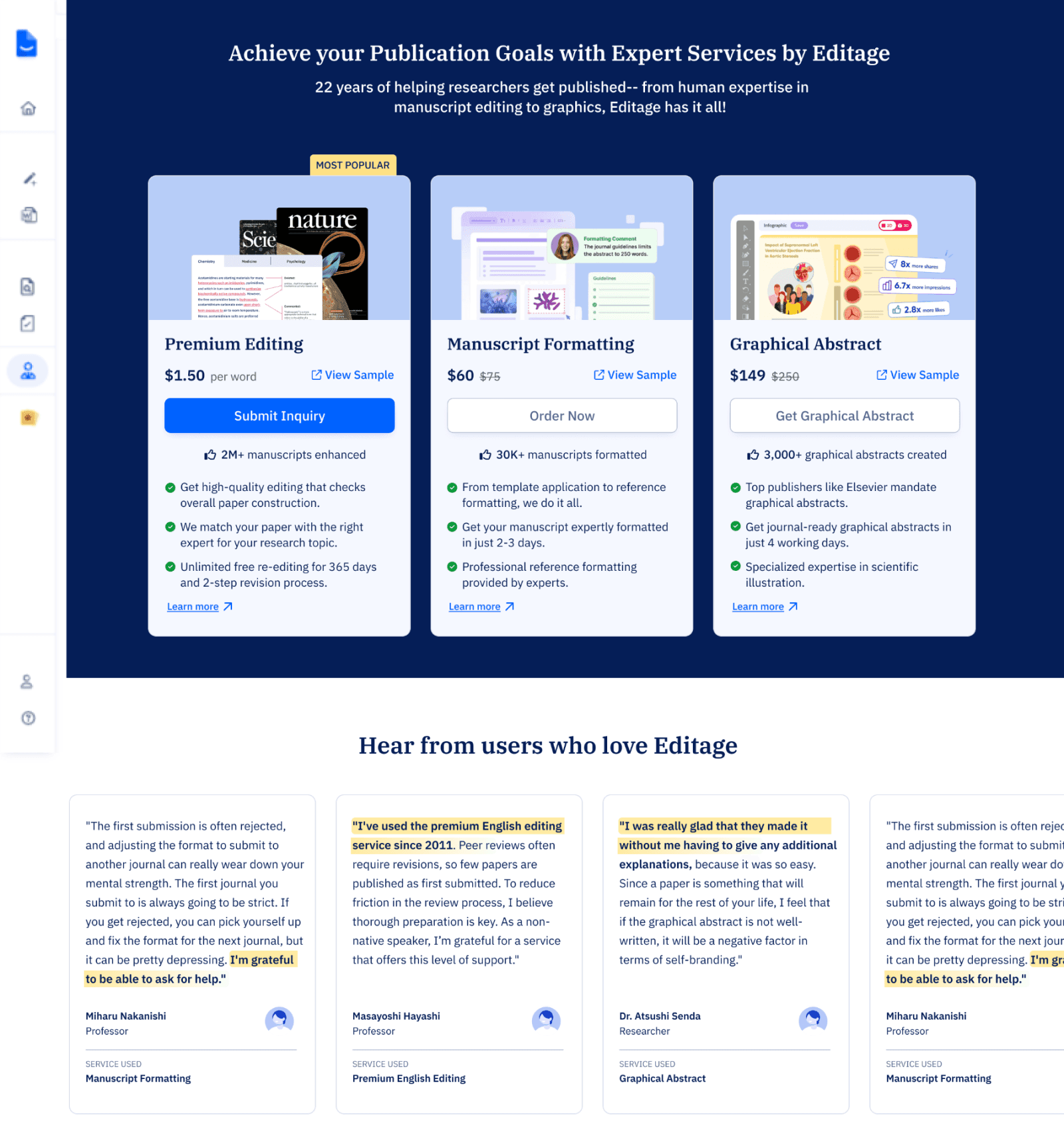
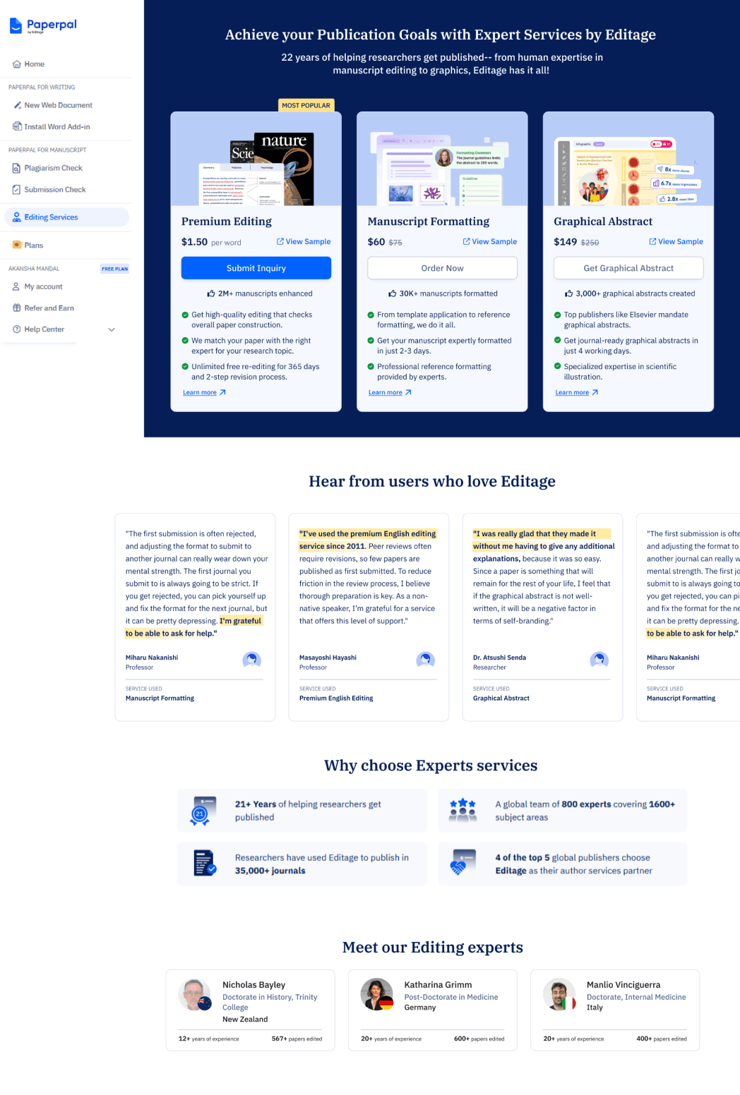
We refined the service card designs, prioritizing Premium Editing as the primary service due to its accessible price, making it a likely first choice for users. The other services were arranged from low to high cost, ensuring clear comparison, with each card presenting essential information at a glance.
The revamped page features redesigned service sections, an enhanced hero section, new review and testimonial layouts, and the introduction of expert profiles to build credibility and trust.
New revamped service page

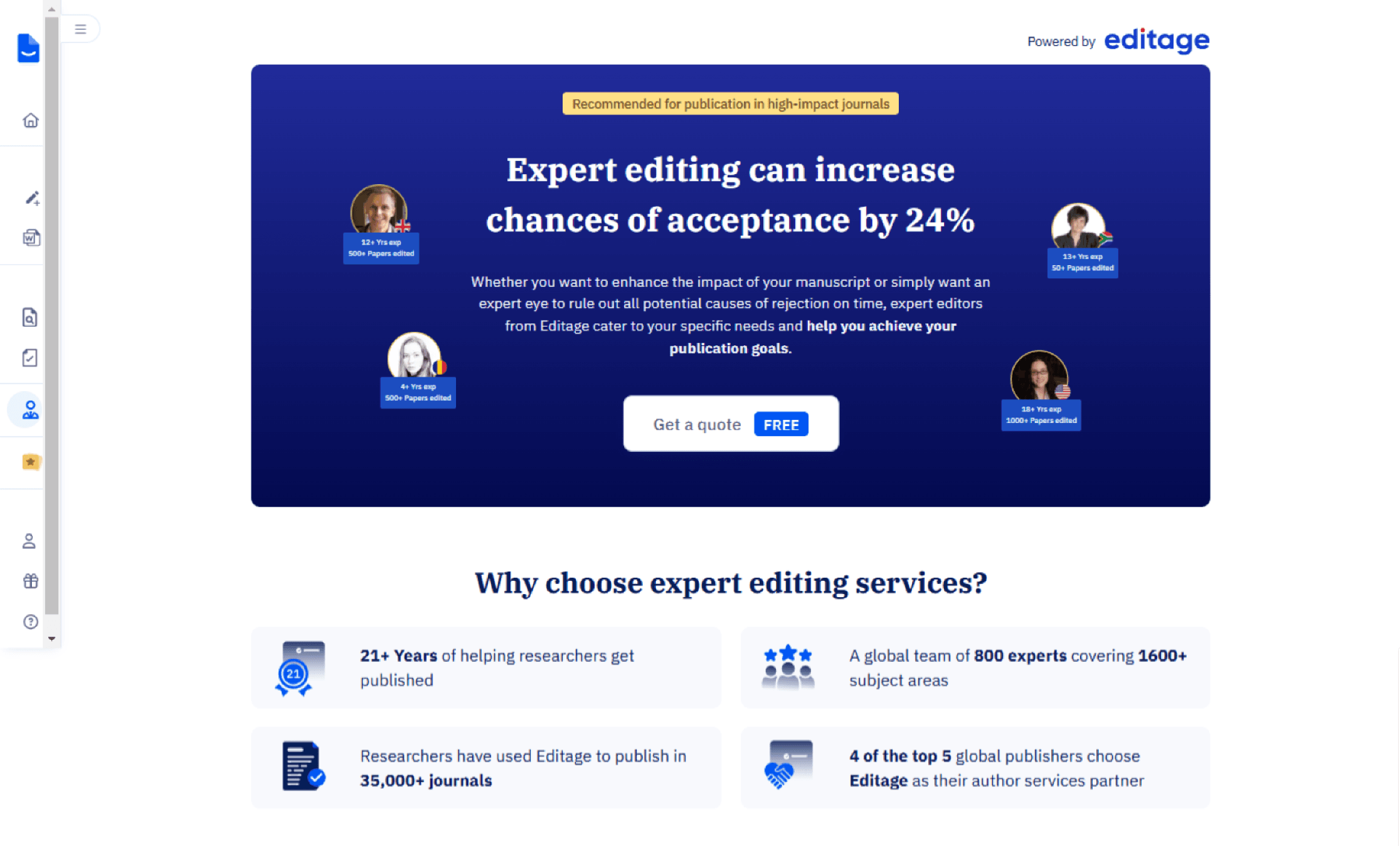
After exploring a few design options, we held an initial design critique with PMs and designers, including the Editage team, to gain deeper product insights. The design team proposed a UX strategy inspired by grocery store checkout placements, aiming to subtly promote services to existing users while enhancing discoverability. We presented three design options: the first aligned with Editage’s existing style, the second took a more experimental approach, and the third featured vertical cards, which we recommended.
Following the design critique, we aligned with stakeholders to move forward with Option 3. It offered a more scannable layout, making it easier for users to compare services quickly. Considering the average user attention span of around 7 seconds, this approach ensured that key information was immediately accessible, enhancing clarity and engagement especially for new users.

OPTION 1
Horizontal card layout
Mixed layout
OPTION 2
Vertical card layout
OPTION 3
Design Critique
Analyzing services
An in-depth exploration of our designs for the selected services to analyze their structure and content.
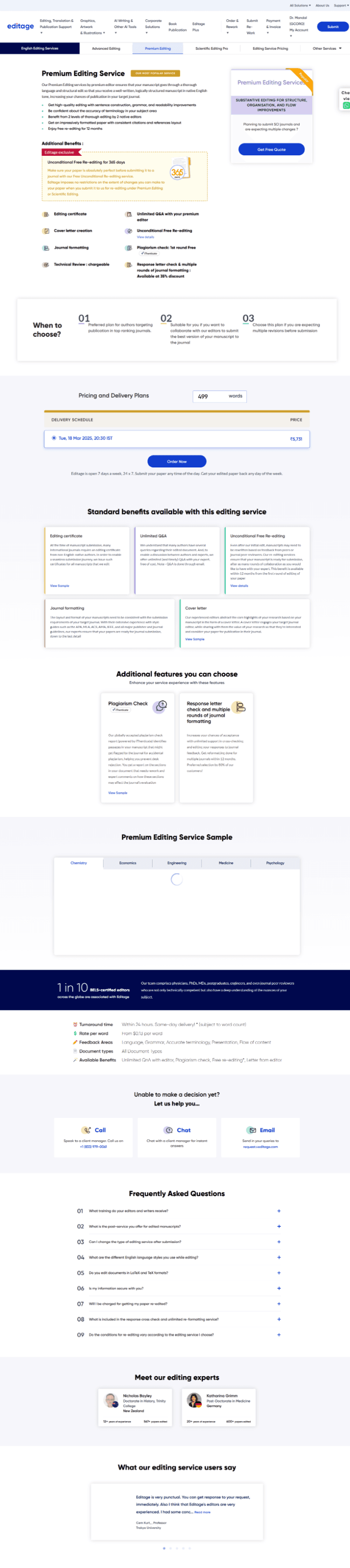


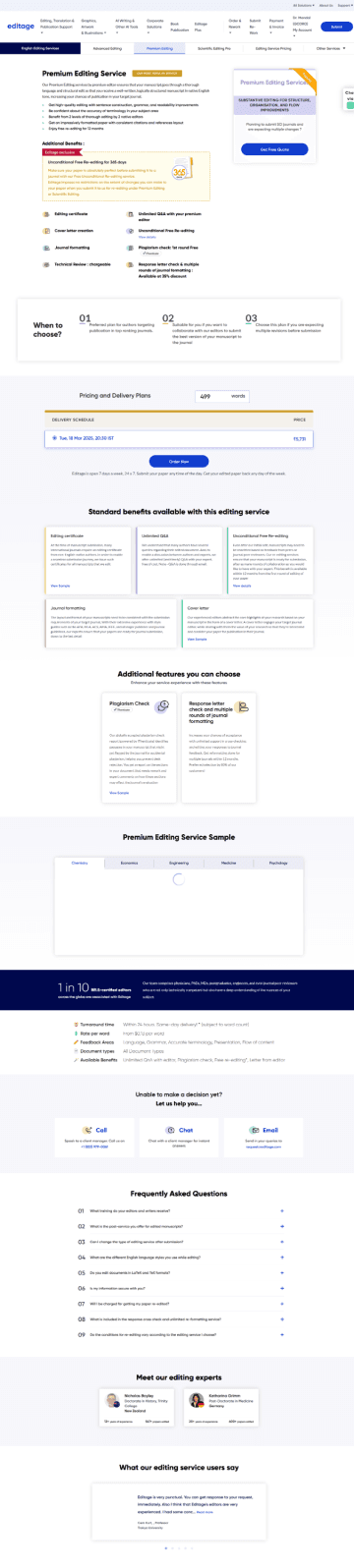
Premium editing
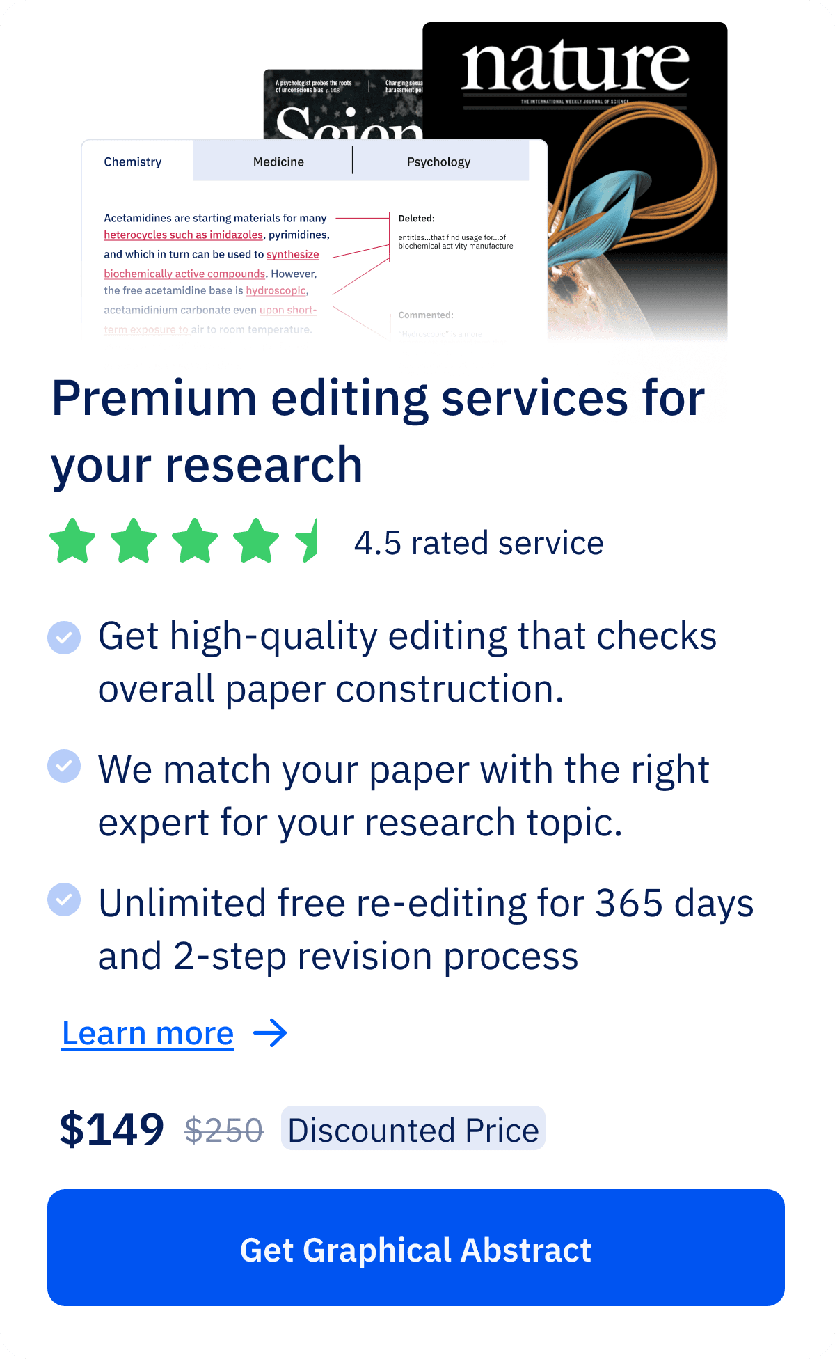
Manuscript formatting
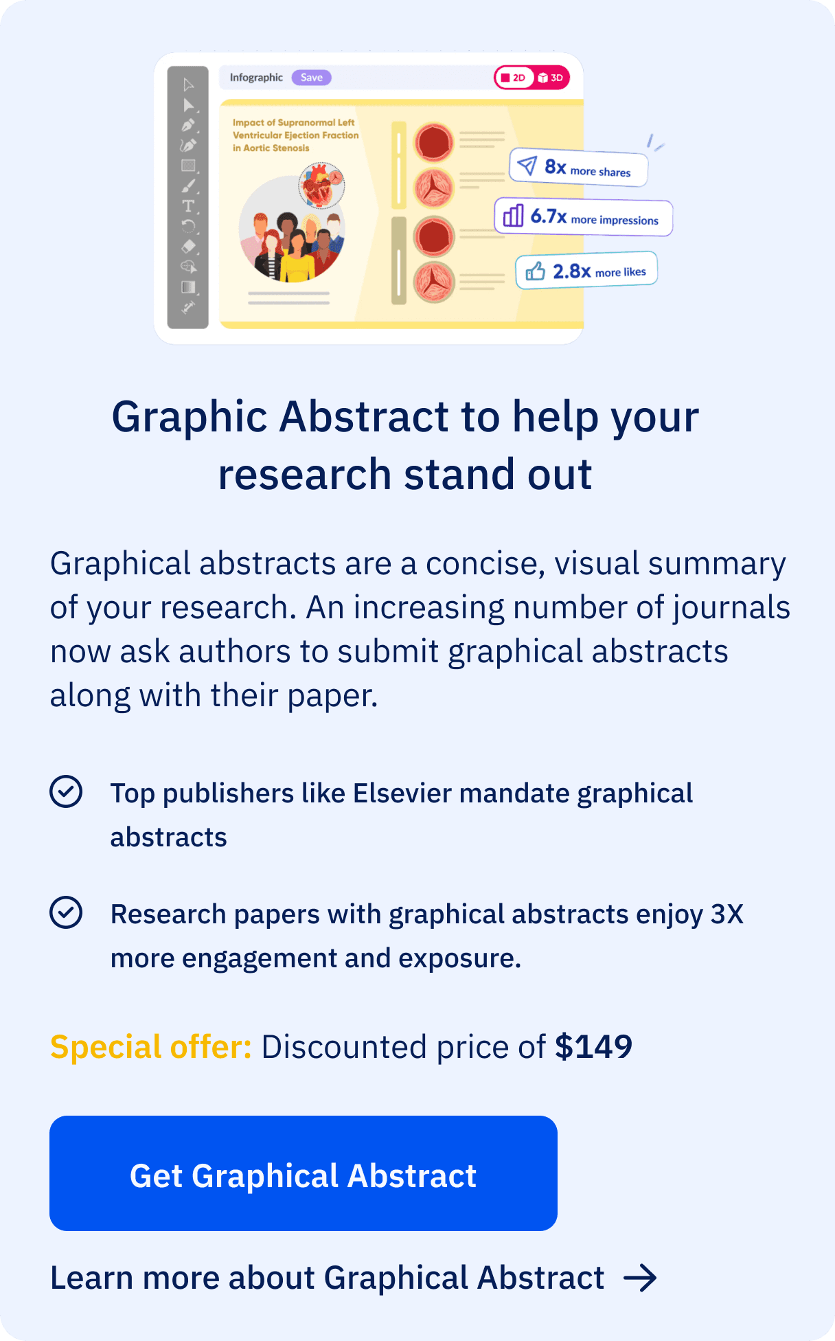
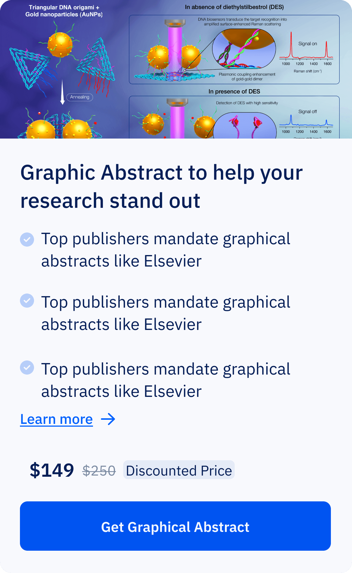
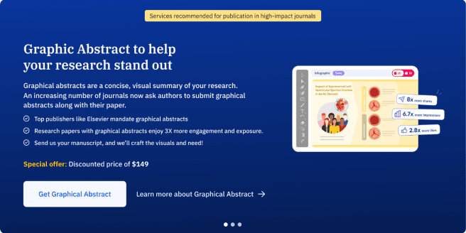
Graphical abstraction
Research & Analysis
why redesign
The current design lacks clarity in showcasing our offerings and provides no clear affordance for users to access the services. Our goal was to identify the top-performing services through collaboration with user researchers and the PM, then find a subtle yet effective way to promote them. Similar to a counter rack near a billing station, ensuring they capture user interest without feeling intrusive.
Premium Editing: Get high quality checks from professionals for your paper.
Graphical Abstraction: Create scientific diagrams for your papers.
Manuscript Formatting: Provide hundred of template and formatting style for research papers.
Defining services
Data insights from Editage services based on the analysis of over 2,000 monthly site visitors.
Editage, as a service platform, offers a range of solutions, from editing and formatting to translation and graphical support. To determine which service to promote on Paperpal, we analyzed user data to identify the most frequently used services, ensuring our focus aligned with user needs.
Final services selected are:
Highlights
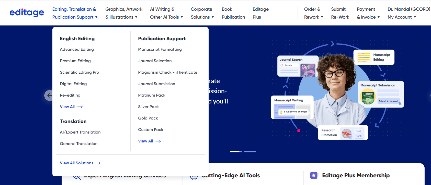
previous design
Current design
Impact
The goal of this redesign is to improve user engagement and increase conversion rates for Editage services. By presenting clearer service options and a more targeted user experience, we aim to increase the percentage of users who proceed from the service page to Editage services


Optimizing Service Discovery Page
PRODUCT DESIGN
USER INTERFACE
Contribution
Worked on concept ideation, interface design, responsive design, user flow creation and UAT under the guidance of my Manager. The project time was 2 -3 weeks.
Project brief
Currently, out of 1,500 users landing on the experts service page, only 500 navigate to Editage(provide human editing services). The page presents a generic view with no specific details about the available services, leading to low engagement. As a result, only 0.5% of users proceed to view and submit the form for Editage services
Takeaway
This project highlighted the importance of knowing when to stop, balancing essential information with minimal effort while preserving context. It also reinforced the value of collaborating with new teams, offering fresh perspectives and insights into different products.
Impact
The launch of the revamped service page had a significant impact, driving an 81% increase in conversions over three months and we have provided around 140 jobs while generating over $50k in revenue.
Takeaway and Impact
Content structure
📍Service Overview
Brief description of the service and its purpose. Highlight who it’s for and the problem it solves.
📍Why Choose This Service?
Key benefits and unique selling points.
📍Access & Support
This section outlines the service access process, pricing, payment options, and FAQs for quick issue resolution.
Design strategy
Prioritizing Visual Hierarchy
Use engaging visuals to enhance understanding and create quick recognition of the service.
Building Trust with Social Proof
Build trust with testimonials, ratings while ensuring transparent pricing.
Highlighting Value Proposition
Clearly highlight the service’s value with concise descriptions and key benefits.
Driving Conversions
Provide clear calls-to-action for service access, along with samples to help users make informed decisions.
After analyzing service pages and identifying key sections, my focus was on creating a clear, intuitive layout that balances content and visuals while guiding users toward action.
Iteration
Evolution of card designs
The initial approach was to design auto-scrollable individual cards as the main header, similar to the original Editage page.
This layout provided more space to include detailed information, larger visuals, and multiple CTAs, ensuring a more engaging and informative experience.
After receiving feedback, we chose to refine the layout to align with the Paperpal design system. Although we’re promoting Editage services, it was crucial to maintain consistency with our product’s visual language. We also decided to feature all three services together in the header as cards, making it easier for users to compare offerings at a glance.
General designs for service cards
*Horizontal cards( we decided not to go with this)

Final Implementation
FINAL CARD designs
service page DESIGN
We refined the service card designs, prioritizing Premium Editing as the primary service due to its accessible price, making it a likely first choice for users. The other services were arranged from low to high cost, ensuring clear comparison, with each card presenting essential information at a glance.
The revamped page features redesigned service sections, an enhanced hero section, new review and testimonial layouts, and the introduction of expert profiles to build credibility and trust.
New revamped service page
After exploring a few design options, we held an initial design critique with PMs and designers, including the Editage team, to gain deeper product insights. The design team proposed a UX strategy inspired by grocery store checkout placements, aiming to subtly promote services to existing users while enhancing discoverability. We presented three design options: the first aligned with Editage’s existing style, the second took a more experimental approach, and the third featured vertical cards, which we recommended.
Following the design critique, we aligned with stakeholders to move forward with Option 3. It offered a more scannable layout, making it easier for users to compare services quickly. Considering the average user attention span of around 7 seconds, this approach ensured that key information was immediately accessible, enhancing clarity and engagement especially for new users.
OPTION 1
Horizontal card layout
Mixed layout
OPTION 2
Vertical card layout
OPTION 3
Design Critique
Analyzing services
An in-depth exploration of our designs for the selected services to analyze their structure and content.


Premium editing
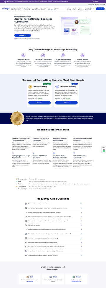
Manuscript formatting
Graphical abstraction
Research & Analysis
why redesign
The current design lacks clarity in showcasing our offerings and provides no clear affordance for users to access the services. Our goal was to identify the top-performing services through collaboration with user researchers and the PM, then find a subtle yet effective way to promote them. Similar to a counter rack near a billing station, ensuring they capture user interest without feeling intrusive.
Premium Editing: Get high quality checks from professionals for your paper.
Graphical Abstraction: Create scientific diagrams for your papers.
Manuscript Formatting: Provide hundred of template and formatting style for research papers.
Defining services
Data insights from Editage services based on the analysis of over 2,000 monthly site visitors.
Editage, as a service platform, offers a range of solutions, from editing and formatting to translation and graphical support. To determine which service to promote on Paperpal, we analyzed user data to identify the most frequently used services, ensuring our focus aligned with user needs.
Final services selected are:
Highlights
previous design
Current design
Impact
The goal of this redesign is to improve user engagement and increase conversion rates for Editage services. By presenting clearer service options and a more targeted user experience, we aim to increase the percentage of users who proceed from the service page to Editage services.
Optimizing Service Discovery Page
PRODUCT DESIGN
USER INTERFACE
Contribution
Worked on concept ideation, interface design, responsive design, user flow creation and UAT under the guidance of my Manager. The project time was 2 -3 weeks.
Project brief
Currently, out of 1,500 users landing on the experts service page, only 500 navigate to Editage(provide human editing services). The page presents a generic view with no specific details about the available services, leading to low engagement. As a result, only 0.5% of users proceed to view and submit the form for Editage services
Takeaway
This project highlighted the importance of knowing when to stop, balancing essential information with minimal effort while preserving context. It also reinforced the value of collaborating with new teams, offering fresh perspectives and insights into different products.
Impact
The launch of the revamped service page had a significant impact, driving an 81% increase in conversions over three months and we have provided around 140 jobs while generating over $50k in revenue.
Takeaway and Impact
Content structure
📍Service Overview
Brief description of the service and its purpose. Highlight who it’s for and the problem it solves.
📍Why Choose This Service?
Key benefits and unique selling points.
📍Access & Support
This section outlines the service access process, pricing, payment options, and FAQs for quick issue resolution.
Design strategy
Prioritizing Visual Hierarchy
Use engaging visuals to enhance understanding and create quick recognition of the service.
Building Trust with Social Proof
Build trust with testimonials, ratings while ensuring transparent pricing.
Highlighting Value Proposition
Clearly highlight the service’s value with concise descriptions and key benefits.
Driving Conversions
Provide clear calls-to-action for service access, along with samples to help users make informed decisions.
After analyzing service pages and identifying key sections, my focus was on creating a clear, intuitive layout that balances content and visuals while guiding users toward action.
Iteration
Evolution of card designs
The initial approach was to design auto-scrollable individual cards as the main header, similar to the original Editage page.
This layout provided more space to include detailed information, larger visuals, and multiple CTAs, ensuring a more engaging and informative experience.
After receiving feedback, we chose to refine the layout to align with the Paperpal design system. Although we’re promoting Editage services, it was crucial to maintain consistency with our product’s visual language. We also decided to feature all three services together in the header as cards, making it easier for users to compare offerings at a glance.
General designs for service cards
*Horizontal cards( we decided not to go with this)
Final Implementation
FINAL CARD designs
service page DESIGN
We refined the service card designs, prioritizing Premium Editing as the primary service due to its accessible price, making it a likely first choice for users. The other services were arranged from low to high cost, ensuring clear comparison, with each card presenting essential information at a glance.
The revamped page features redesigned service sections, an enhanced hero section, new review and testimonial layouts, and the introduction of expert profiles to build credibility and trust.
New revamped service page
After exploring a few design options, we held an initial design critique with PMs and designers, including the Editage team, to gain deeper product insights. The design team proposed a UX strategy inspired by grocery store checkout placements, aiming to subtly promote services to existing users while enhancing discoverability. We presented three design options: the first aligned with Editage’s existing style, the second took a more experimental approach, and the third featured vertical cards, which we recommended.
Following the design critique, we aligned with stakeholders to move forward with Option 3. It offered a more scannable layout, making it easier for users to compare services quickly. Considering the average user attention span of around 7 seconds, this approach ensured that key information was immediately accessible, enhancing clarity and engagement especially for new users.


OPTION 1
Horizontal card layout
Mixed layout
OPTION 2
Vertical card layout
OPTION 3
Design Critique
Analyzing services
An in-depth exploration of our designs for the selected services to analyze their structure and content.
Premium editing
Manuscript formatting
Graphical abstraction
Research & Analysis
why redesign
The current design lacks clarity in showcasing our offerings and provides no clear affordance for users to access the services. Our goal was to identify the top-performing services through collaboration with user researchers and the PM, then find a subtle yet effective way to promote them. Similar to a counter rack near a billing station, ensuring they capture user interest without feeling intrusive.
Premium Editing: Get high quality checks from professionals for your paper.
Graphical Abstraction: Create scientific diagrams for your papers.
Manuscript Formatting: Provide hundred of template and formatting style for research papers.
Defining services
Data insights from Editage services based on the analysis of over 2,000 monthly site visitors.
Editage, as a service platform, offers a range of solutions, from editing and formatting to translation and graphical support. To determine which service to promote on Paperpal, we analyzed user data to identify the most frequently used services, ensuring our focus aligned with user needs.
Final services selected are:
Highlights
previous design
Current design
Impact
The goal of this redesign is to improve user engagement and increase conversion rates for Editage services. By presenting clearer service options and a more targeted user experience, we aim to increase the percentage of users who proceed from the service page to Editage services.

