Designing a Scalable Notification System
USER INTERFACE
SYSTEMS


Contribution
I Worked on concept exploration, interface design, visual design, user flow mapping and UAT along with my Lead Product designer and PM. The project time was 3-4 weeks, resulting in platform-wide system adoption.
TLDR
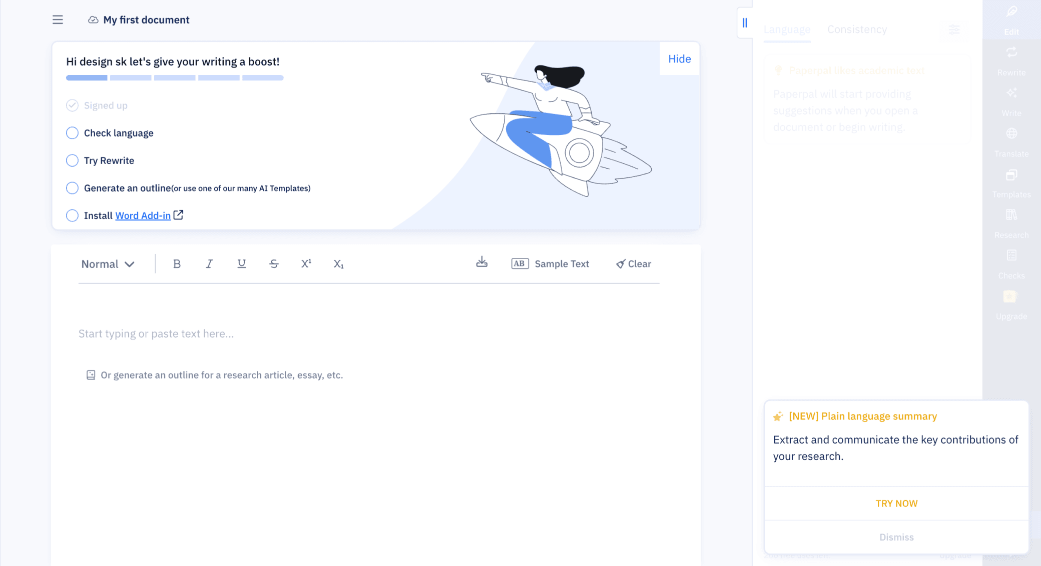
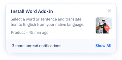
As Paperpal scaled globally, its lack of a unified messaging system led to severe internal inconsistencies. Teams were pushing messages via 3+ different visual formats, causing user confusion and delaying critical feature adoption.
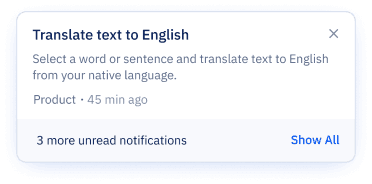
I led the redesign of a modular notification system and persistent tray UI. This initiative was focused on defining a clear Information Architecture to structure all message types into a single, scalable component library.
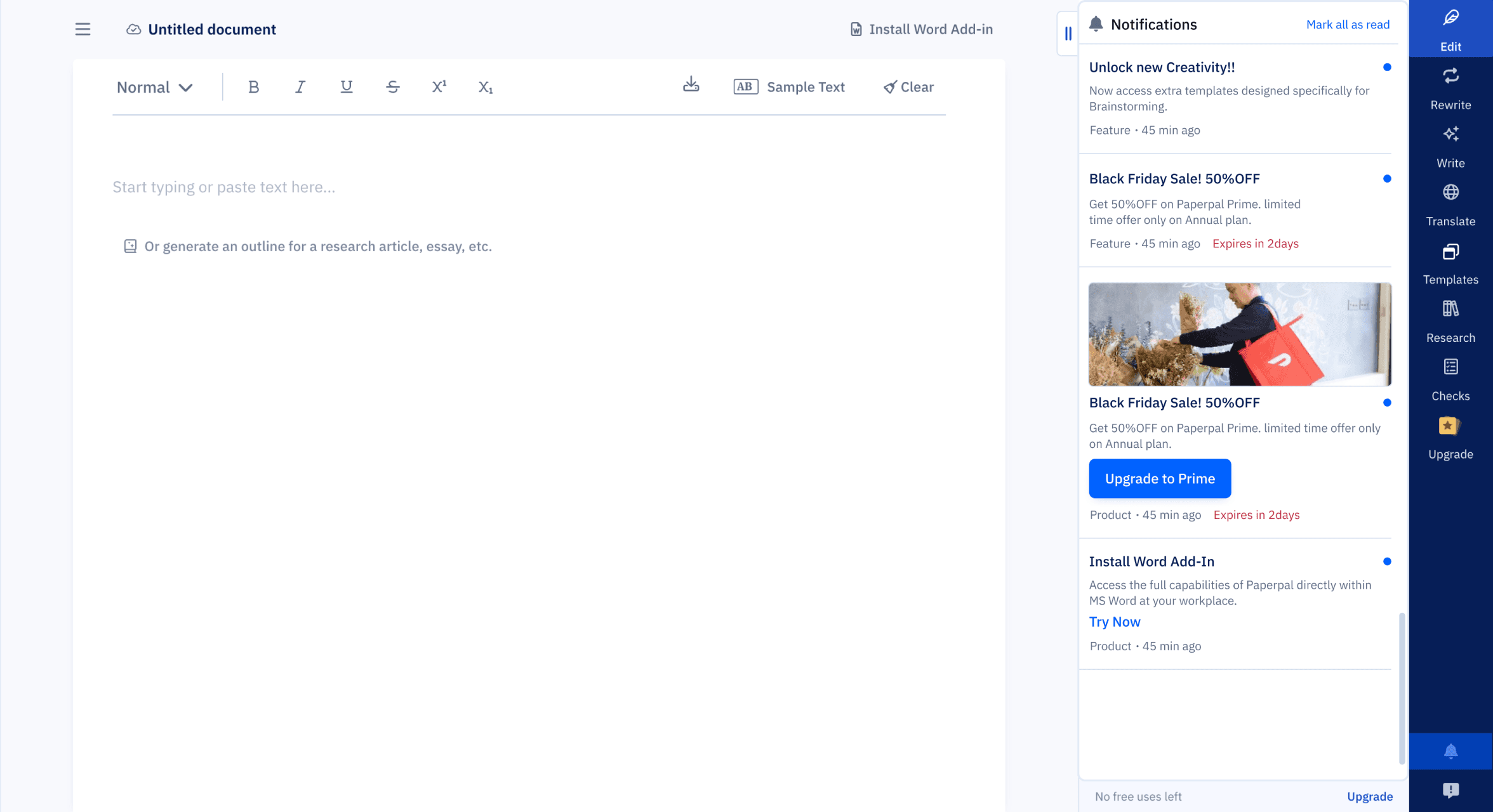
BEFORE
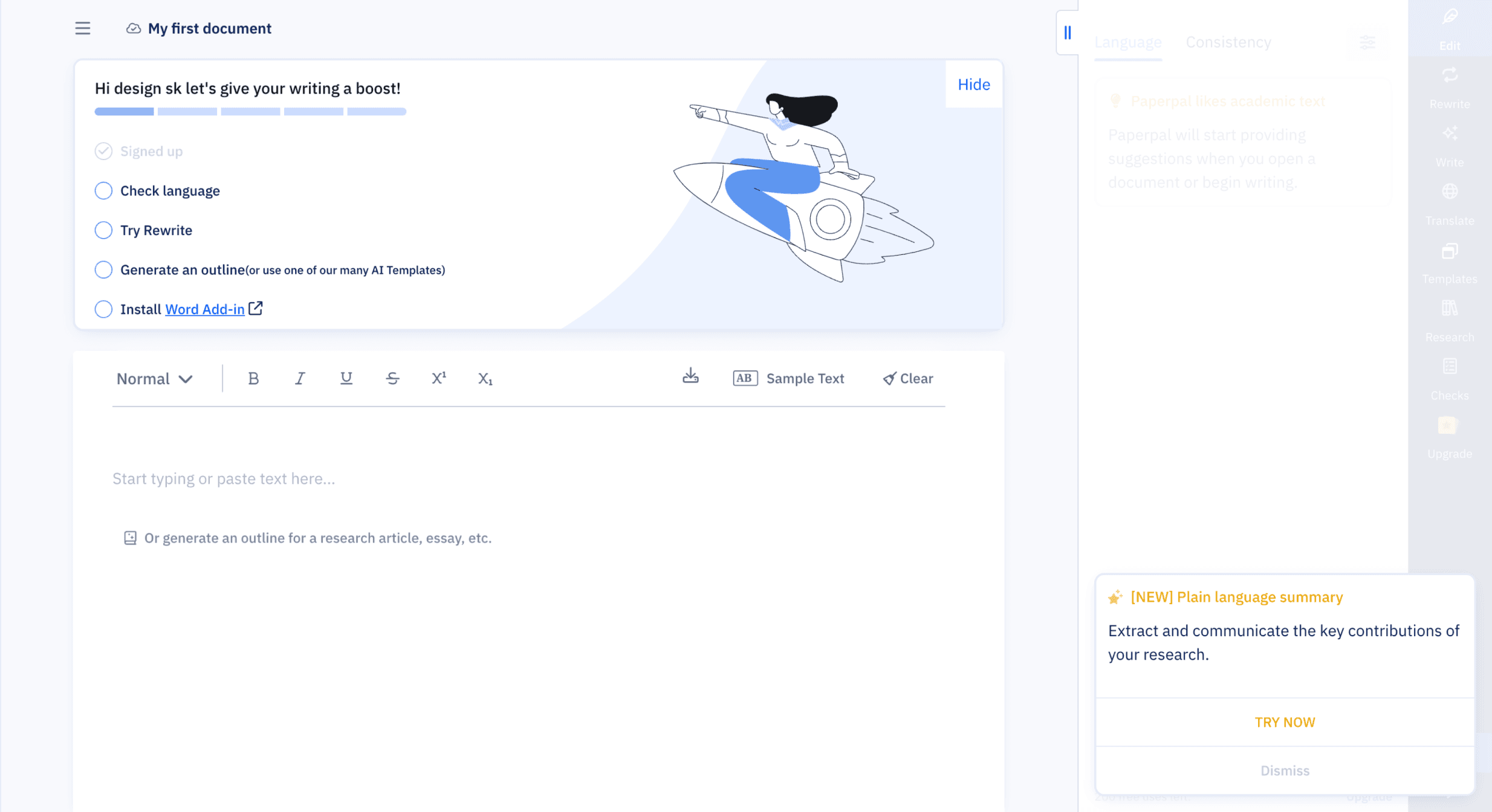
AFTER

How I Got Here
This started as a “small task” fix a messy pop-up. But when I dug deeper, I realized we didn’t have a notification system at all. We had multiple messages from product and marketing, being pushed inconsistently, without logic or structure and users across multiple countries were getting overwhelmed. I wasn’t just designing a banner I was designing an information architecture
The Problem
Existing state
🚩Notifications appeared inconsistently at login
🚩Different teams pushed different messages
🚩No visual consistency, hierarchy, or history
🚩No Classification for the messages
What was caused
😔Users missed critical product updates and offers
💣Users bombarded my messages at random time
🕐There was no way to revisit messages
Discovery (What I Uncovered)
I started by building a full notification map, auditing to map the existing chaos across the platform.
Key Findings
Inconsistent formats across 3+ styles (fonts, layout, CTAs)

Multiple message types being sent without structure:
Feature updates
Enhancements
Nudges
Extension prompts
Referrals
Offers
Personalized alerts
Analysis
To introduce clarity and control, I created a clear Information Architecture by grouping all existing and future messages into three core, non-overlapping categories.
This structure made it easier to define design patterns, shelf life rules, and delivery priorities, without overwhelming the user.
Product
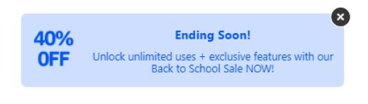
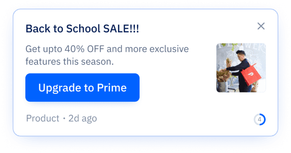
Offers & Discount
Marketing
Critical system updates, new features, and technical alerts. (High Priority)
Time-sensitive promotions and personalized pricing. (Medium Priority)
General engagement, extension prompts, or referrals. (Low Priority)
This structure made it easier to define design patterns, shelf life rules, and delivery priorities, without overwhelming the user.
DESIGN GOALs
Consistency
Every notification should follow a unified structure
Scalability
New message types must slot in logically
Discoverability
Users must be able to revisit updates easily
Clarity
Support country-specific promos and variable expiry
Non-disruptive
Inform, don’t overwhelm


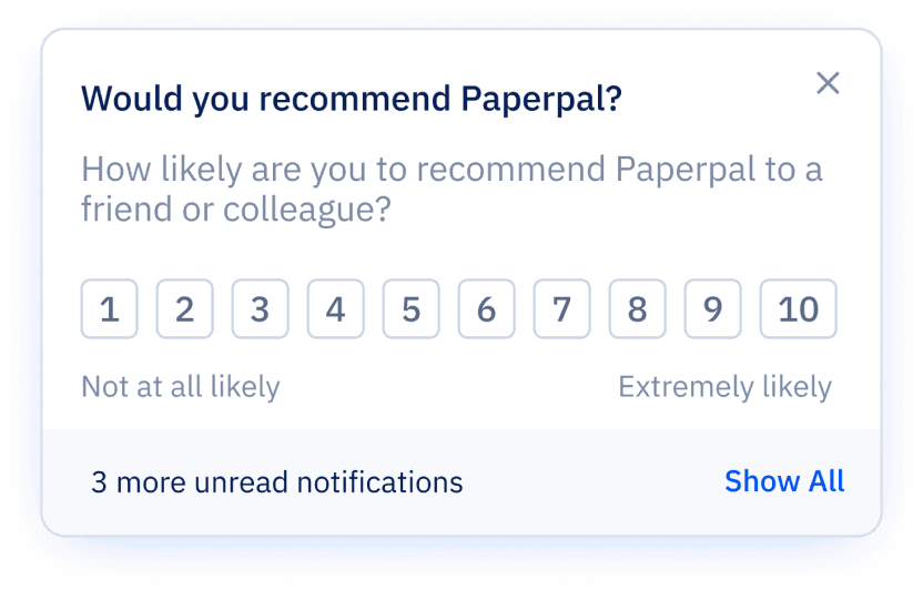
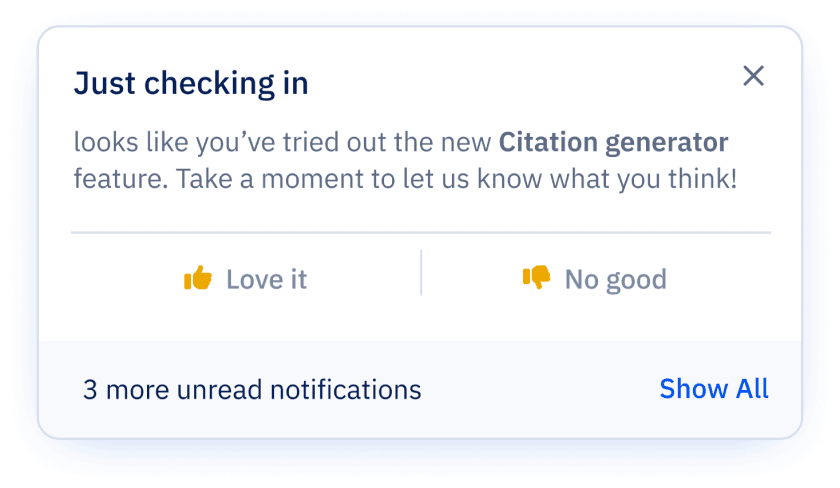
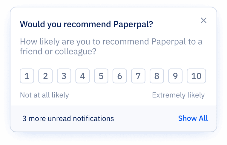
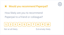
Another rating message
Promotion message
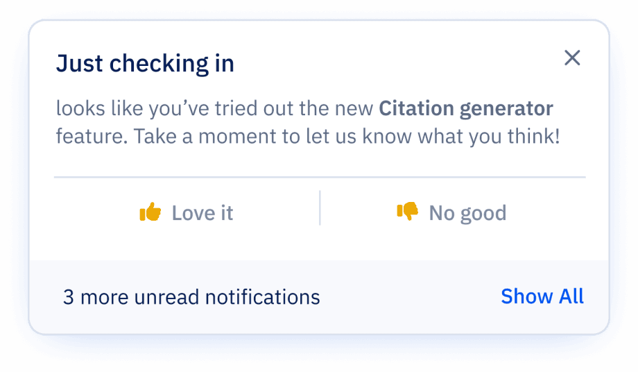
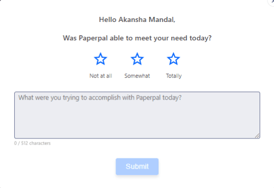
Feedback message
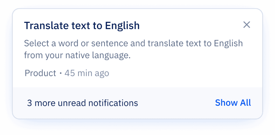
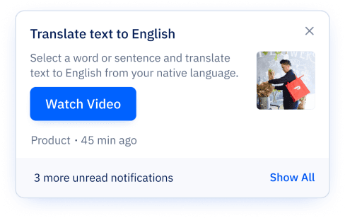
Feature promotion
Solution no.1
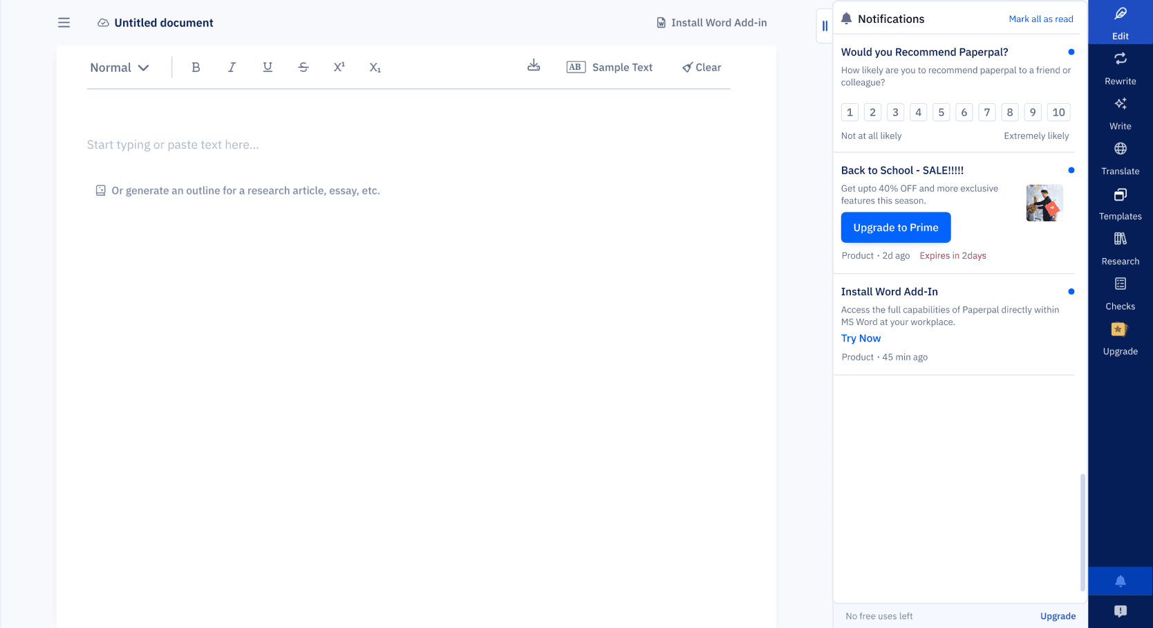
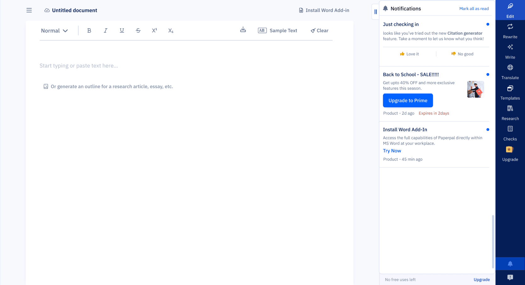
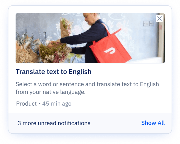
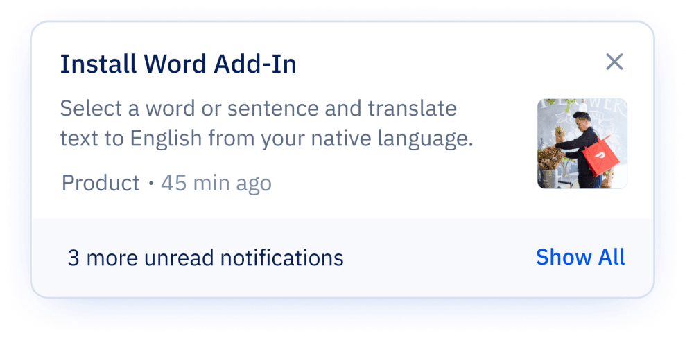
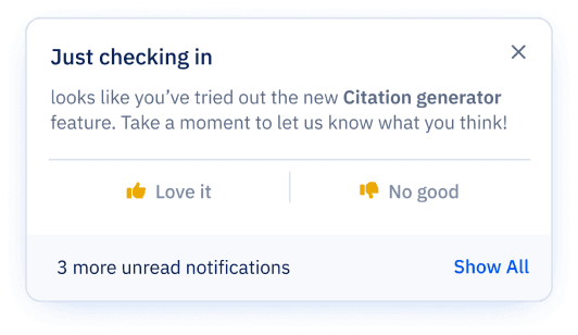
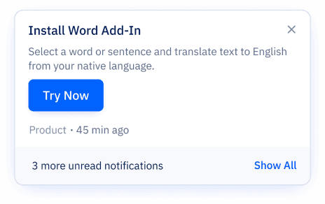
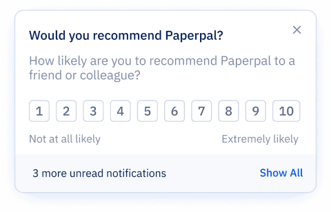
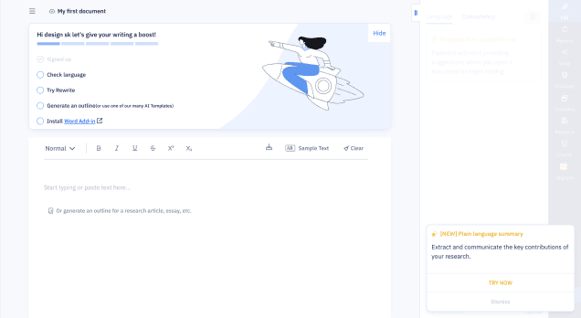
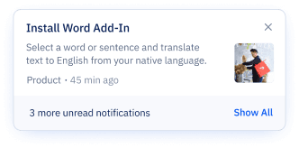
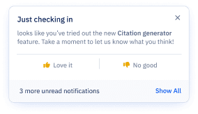
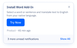
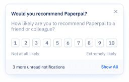
Real-Time Notifications (Modular Cards)
Designing across multiple scenarios with different content and interaction types was initially challenging, especially working through Figma variants and logic. But after refining the structure (and a few late nights), I created a scalable, modular card system that’s now easier to implement, reuse, and document.
System Highlights:
Triggered at login or user actions
Modular structure to support flexible content formats:
Text only
Text + CTA
Text + Image + CTA
Primary & secondary CTAs
Standardized layout with tags, timestamps, and read states for consistency and clarity


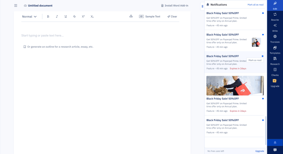
Solution no.2
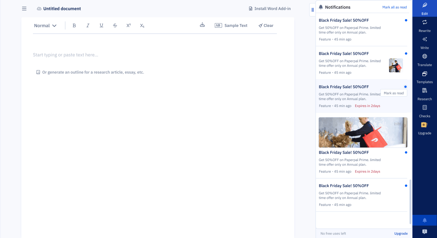
Persistent Notification Tray
To address the issue of lost history, I designed a single, discoverable Tray UI accessed via a persistent icon in the header.
🧩 Features includes:
Shelf life defaults to 30 days, but adjustable depends on type of notification and context
Unread states (blue dot) with hover state to mark as read
Messages shows in chronological date order


Hover state
Feature feedback
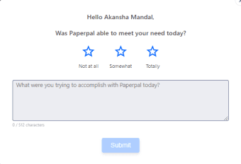
Rating message
Product message
New feature launch
Reflections and Impact
Reflections
I learned that notification UX isn’t just about timing it’s about trust. Users don’t just need alerts. They need context, prioritization, and choice.
💡 Personal Takeaways:
Every system you design has consequences for other teams
Discoverability should never be optional
UI clarity often comes from structural decisions, not just visual ones
Impact
The new system achieved its core goal of de-risking system messaging and improving team efficiency:
Design Scalability: The defined IA and modular components are now the single source of truth, reducing future design effort for new message types.
Operational Clarity: Product and Marketing teams can now launch concurrent campaigns without conflicting with other messages, solving a major internal workflow friction point.
Accessibility & Consistency: Eliminated inconsistent legacy formats, ensuring all new platform communications adhere to a single, WCAG-compliant visual standard.

Designing a Scalable Notification System
USER INTERFACE
SYSTEMS
Contribution
I Worked on concept exploration, interface design, visual design, user flow mapping and UAT along with my Lead Product designer and PM. The project time was 3-4 weeks, resulting in platform-wide system adoption.
TLDR
As Paperpal scaled globally, its lack of a unified messaging system led to severe internal inconsistencies. Teams were pushing messages via 3+ different visual formats, causing user confusion and delaying critical feature adoption.
I led the redesign of a modular notification system and persistent tray UI. This initiative was focused on defining a clear Information Architecture to structure all message types into a single, scalable component library.
BEFORE

AFTER

How I Got Here
This started as a “small task” fix a messy pop-up. But when I dug deeper, I realized we didn’t have a notification system at all. We had multiple messages from product and marketing, being pushed inconsistently, without logic or structure and users across multiple countries were getting overwhelmed. I wasn’t just designing a banner I was designing an information architecture
The Problem
Existing state
🚩Notifications appeared inconsistently at login
🚩Different teams pushed different messages
🚩No visual consistency, hierarchy, or history
🚩No Classification for the messages
What was caused
😔Users missed critical product updates and offers
💣Users bombarded my messages at random time
🕐There was no way to revisit messages
Discovery (What I Uncovered)
I started by building a full notification map, auditing to map the existing chaos across the platform.
Key Findings
Inconsistent formats across 3+ styles (fonts, layout, CTAs)

Multiple message types being sent without structure:
Feature updates
Enhancements
Nudges
Extension prompts
Referrals
Offers
Personalized alerts
Analysis
To introduce clarity and control, I created a clear Information Architecture by grouping all existing and future messages into three core, non-overlapping categories.
This structure made it easier to define design patterns, shelf life rules, and delivery priorities, without overwhelming the user.
Product
Offers & Discount
Marketing
Critical system updates, new features, and technical alerts. (High Priority)
Time-sensitive promotions and personalized pricing. (Medium Priority)
General engagement, extension prompts, or referrals. (Low Priority)
This structure made it easier to define design patterns, shelf life rules, and delivery priorities, without overwhelming the user.
DESIGN GOALs
Consistency
Every notification should follow a unified structure
Scalability
New message types must slot in logically
Discoverability
Users must be able to revisit updates easily
Clarity
Support country-specific promos and variable expiry
Non-disruptive
Inform, don’t overwhelm

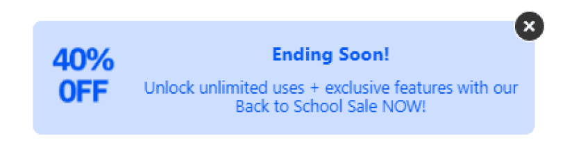
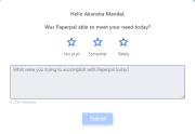
Another rating message
Promotion message
Feedback message
Feature promotion
Solution no.1
Real-Time Notifications (Modular Cards)
Designing across multiple scenarios with different content and interaction types was initially challenging, especially working through Figma variants and logic. But after refining the structure (and a few late nights), I created a scalable, modular card system that’s now easier to implement, reuse, and document.
System Highlights:
Triggered at login or user actions
Modular structure to support flexible content formats:
Text only
Text + CTA
Text + Image + CTA
Primary & secondary CTAs
Standardized layout with tags, timestamps, and read states for consistency and clarity


Solution no.2
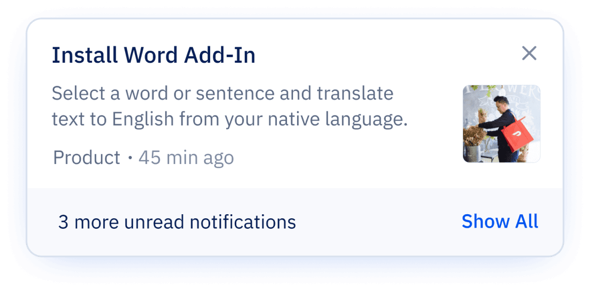
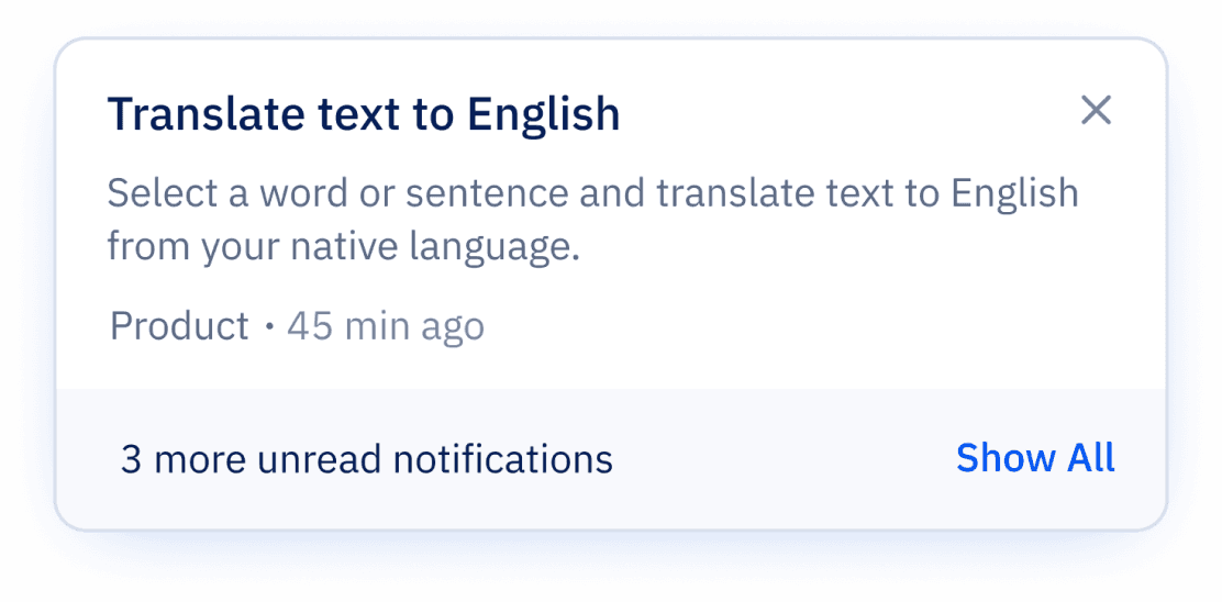
Persistent Notification Tray
To address the issue of lost history, I designed a single, discoverable Tray UI accessed via a persistent icon in the header.
🧩 Features includes:
Shelf life defaults to 30 days, but adjustable depends on type of notification and context
Unread states (blue dot) with hover state to mark as read
Messages shows in chronological date order


Hover state
Feature feedback
Rating message
Product message
New feature launch
Reflections and Impact
Reflections
I learned that notification UX isn’t just about timing it’s about trust. Users don’t just need alerts. They need context, prioritization, and choice.
💡 Personal Takeaways:
Every system you design has consequences for other teams
Discoverability should never be optional
UI clarity often comes from structural decisions, not just visual ones
Impact
The new system achieved its core goal of de-risking system messaging and improving team efficiency:
Design Scalability: The defined IA and modular components are now the single source of truth, reducing future design effort for new message types.
Operational Clarity: Product and Marketing teams can now launch concurrent campaigns without conflicting with other messages, solving a major internal workflow friction point.
Accessibility & Consistency: Eliminated inconsistent legacy formats, ensuring all new platform communications adhere to a single, WCAG-compliant visual standard.
Designing a Scalable Notification System
USER INTERFACE
SYSTEMS


Contribution
I Worked on concept exploration, interface design, visual design, user flow mapping and UAT along with my Lead Product designer and PM. The project time was 3-4 weeks, resulting in platform-wide system adoption.
TLDR
As Paperpal scaled globally, its lack of a unified messaging system led to severe internal inconsistencies. Teams were pushing messages via 3+ different visual formats, causing user confusion and delaying critical feature adoption.
I led the redesign of a modular notification system and persistent tray UI. This initiative was focused on defining a clear Information Architecture to structure all message types into a single, scalable component library.
BEFORE

AFTER

How I Got Here
This started as a “small task” fix a messy pop-up. But when I dug deeper, I realized we didn’t have a notification system at all. We had multiple messages from product and marketing, being pushed inconsistently, without logic or structure and users across multiple countries were getting overwhelmed. I wasn’t just designing a banner I was designing an information architecture
The Problem
Existing state
🚩Notifications appeared inconsistently at login
🚩Different teams pushed different messages
🚩No visual consistency, hierarchy, or history
🚩No Classification for the messages
What was caused
😔Users missed critical product updates and offers
💣Users bombarded my messages at random time
🕐There was no way to revisit messages
Discovery (What I Uncovered)
I started by building a full notification map, auditing to map the existing chaos across the platform.
Key Findings
Inconsistent formats across 3+ styles (fonts, layout, CTAs)
Multiple message types being sent without structure:
Feature updates
Enhancements
Nudges
Extension prompts
Referrals
Offers
Personalized alerts
Analysis
To introduce clarity and control, I created a clear Information Architecture by grouping all existing and future messages into three core, non-overlapping categories.
This structure made it easier to define design patterns, shelf life rules, and delivery priorities, without overwhelming the user.
Product
Offers & Discount
Marketing
Critical system updates, new features, and technical alerts. (High Priority)
Time-sensitive promotions and personalized pricing. (Medium Priority)
General engagement, extension prompts, or referrals. (Low Priority)
This structure made it easier to define design patterns, shelf life rules, and delivery priorities, without overwhelming the user.
DESIGN GOALs
Consistency
Every notification should follow a unified structure
Scalability
New message types must slot in logically
Discoverability
Users must be able to revisit updates easily
Clarity
Support country-specific promos and variable expiry
Non-disruptive
Inform, don’t overwhelm


Another rating message
Promotion message
Feedback message
Feature promotion
Solution no.1
Real-Time Notifications (Modular Cards)
Designing across multiple scenarios with different content and interaction types was initially challenging, especially working through Figma variants and logic. But after refining the structure (and a few late nights), I created a scalable, modular card system that’s now easier to implement, reuse, and document.
System Highlights:
Triggered at login or user actions
Modular structure to support flexible content formats:
Text only
Text + CTA
Text + Image + CTA
Primary & secondary CTAs
Standardized layout with tags, timestamps, and read states for consistency and clarity


Solution no.2
Persistent Notification Tray
To address the issue of lost history, I designed a single, discoverable Tray UI accessed via a persistent icon in the header.
🧩 Features includes:
Shelf life defaults to 30 days, but adjustable depends on type of notification and context
Unread states (blue dot) with hover state to mark as read
Messages shows in chronological date order


Hover state
Feature feedback
Rating message
Product message
New feature launch
Reflections and Impact
Reflections
I learned that notification UX isn’t just about timing it’s about trust. Users don’t just need alerts. They need context, prioritization, and choice.
💡 Personal Takeaways:
Every system you design has consequences for other teams
Discoverability should never be optional
UI clarity often comes from structural decisions, not just visual ones
Impact
The new system achieved its core goal of de-risking system messaging and improving team efficiency:
Design Scalability: The defined IA and modular components are now the single source of truth, reducing future design effort for new message types.
Operational Clarity: Product and Marketing teams can now launch concurrent campaigns without conflicting with other messages, solving a major internal workflow friction point.
Accessibility & Consistency: Eliminated inconsistent legacy formats, ensuring all new platform communications adhere to a single, WCAG-compliant visual standard.
Designing a Scalable Notification System
USER INTERFACE
SYSTEMS

Contribution
I Worked on concept exploration, interface design, visual design, user flow mapping and UAT along with my Lead Product designer and PM. The project time was 3-4 weeks, resulting in platform-wide system adoption.
TLDR
As Paperpal scaled globally, its lack of a unified messaging system led to severe internal inconsistencies. Teams were pushing messages via 3+ different visual formats, causing user confusion and delaying critical feature adoption.
I led the redesign of a modular notification system and persistent tray UI. This initiative was focused on defining a clear Information Architecture to structure all message types into a single, scalable component library.
BEFORE
AFTER

How I Got Here
This started as a “small task” fix a messy pop-up. But when I dug deeper, I realized we didn’t have a notification system at all. We had multiple messages from product and marketing, being pushed inconsistently, without logic or structure and users across multiple countries were getting overwhelmed. I wasn’t just designing a banner I was designing an information architecture
The Problem
Existing state
🚩Notifications appeared inconsistently at login
🚩Different teams pushed different messages
🚩No visual consistency, hierarchy, or history
🚩No Classification for the messages
What was caused
😔Users missed critical product updates and offers
💣Users bombarded my messages at random time
🕐There was no way to revisit messages
Discovery (What I Uncovered)
I started by building a full notification map, auditing to map the existing chaos across the platform.
Key Findings
Inconsistent formats across 3+ styles (fonts, layout, CTAs)
Multiple message types being sent without structure:
Feature updates
Enhancements
Nudges
Extension prompts
Referrals
Offers
Personalized alerts
Analysis
To introduce clarity and control, I created a clear Information Architecture by grouping all existing and future messages into three core, non-overlapping categories.
This structure made it easier to define design patterns, shelf life rules, and delivery priorities, without overwhelming the user.
Product
Offers & Discount
Marketing
Critical system updates, new features, and technical alerts. (High Priority)
Time-sensitive promotions and personalized pricing. (Medium Priority)
General engagement, extension prompts, or referrals. (Low Priority)
This structure made it easier to define design patterns, shelf life rules, and delivery priorities, without overwhelming the user.
DESIGN GOALs
Consistency
Every notification should follow a unified structure
Scalability
New message types must slot in logically
Discoverability
Users must be able to revisit updates easily
Clarity
Support country-specific promos and variable expiry
Non-disruptive
Inform, don’t overwhelm


Another rating message
Promotion message
Feedback message
Feature promotion
Solution no.1
Real-Time Notifications (Modular Cards)
Designing across multiple scenarios with different content and interaction types was initially challenging, especially working through Figma variants and logic. But after refining the structure (and a few late nights), I created a scalable, modular card system that’s now easier to implement, reuse, and document.
System Highlights:
Triggered at login or user actions
Modular structure to support flexible content formats:
Text only
Text + CTA
Text + Image + CTA
Primary & secondary CTAs
Standardized layout with tags, timestamps, and read states for consistency and clarity


Solution no.2
Persistent Notification Tray
To address the issue of lost history, I designed a single, discoverable Tray UI accessed via a persistent icon in the header.
🧩 Features includes:
Shelf life defaults to 30 days, but adjustable depends on type of notification and context
Unread states (blue dot) with hover state to mark as read
Messages shows in chronological date order


Hover state
Feature feedback
Rating message
Product message
New feature launch
Reflections and Impact
Reflections
I learned that notification UX isn’t just about timing it’s about trust. Users don’t just need alerts. They need context, prioritization, and choice.
💡 Personal Takeaways:
Every system you design has consequences for other teams
Discoverability should never be optional
UI clarity often comes from structural decisions, not just visual ones
Impact
The new system achieved its core goal of de-risking system messaging and improving team efficiency:
Design Scalability: The defined IA and modular components are now the single source of truth, reducing future design effort for new message types.
Operational Clarity: Product and Marketing teams can now launch concurrent campaigns without conflicting with other messages, solving a major internal workflow friction point.
Accessibility & Consistency: Eliminated inconsistent legacy formats, ensuring all new platform communications adhere to a single, WCAG-compliant visual standard.